HAI ROBOTICS
DIFFERENTIATE YOURSELF
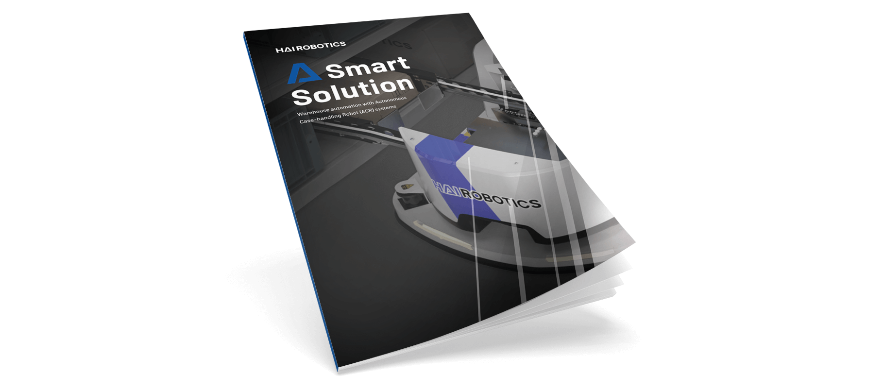
HAI Robotics is a Chinese company that as a new player is now targeting the European market. HAI stands for innovation and being forward-looking. They want a good visual translation of the Chinese brochure into one that appeals to the European market.
Experience
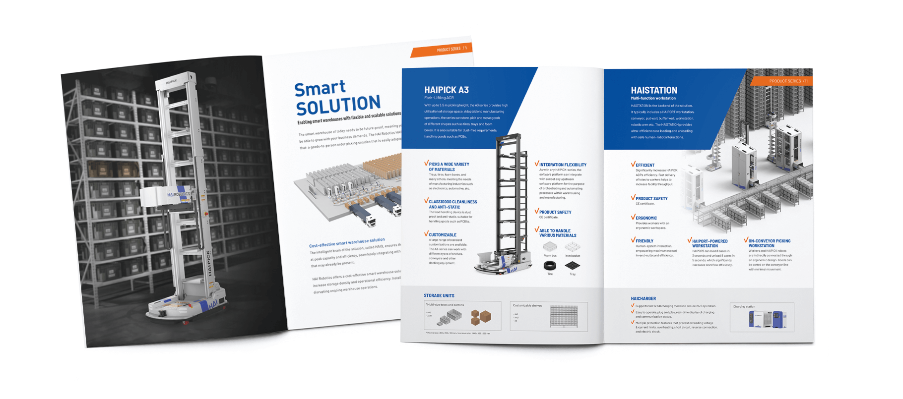
The existing designs by the Hai Robotics in-house designer in Taipei are quite basic and mainly used different shades of gray. For us, the experience was missing. ´How do you stand out among all the vendors, what makes you unique and are you the best match for your customer’s demand?´ In addition, Hai Robotics wants to exude stability and confidence.
Productbrochure
Through mood images and catchy headings, we strive to arouse curiosity and encourage people to read on. We wanted to create a cool, fresh and trustworthy look.
Color
We chose to use the color blue, which is present in the logo, in the brochure through color blocks. Blue streets for trust and also ensures brand recognition.
Research has shown that people subconsciously make a judgment about a person or a product within 90 seconds of the first impression. Between 62% and 90% of that judgment is based on color alone.
– Source: CCI COLOR – Institute for Color Research

